Atlanta Braves Rebranding: Atlanta Venture.
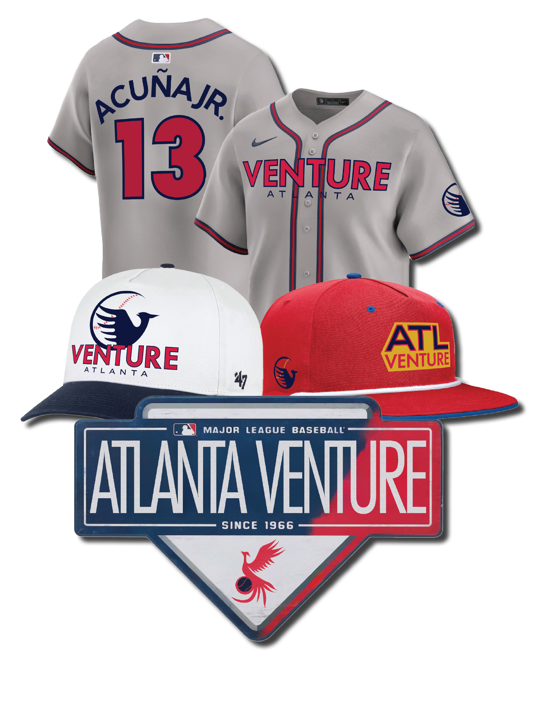
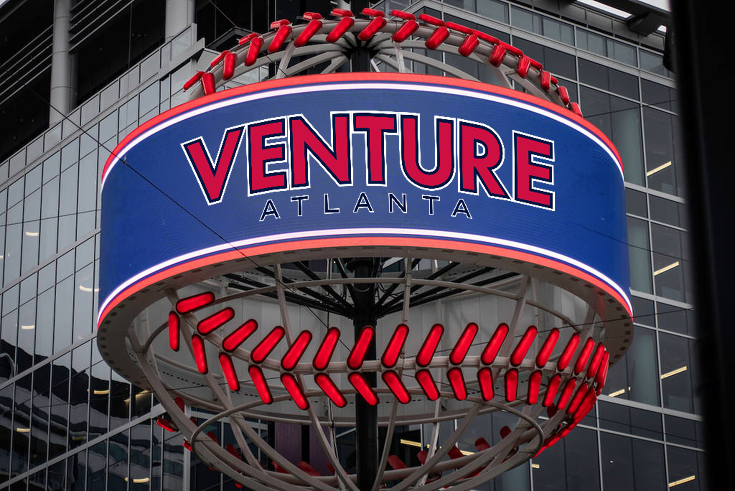
I created a re-brand of the MLB Atlanta Braves to the Atlanta Venture, representing a group of phoenixes, along with a new logo, but the color palette staying true to the previous colors. My brand ethos embodies the traits of the phoenix. Strong, dependable, and courageous. This will be shown through a logo that is strong and sleek and a color palette that continues the idea of “America’s team.”
The new logo combines a phoenix, a strong symbol for Atlanta after rising from the ashes after the Civil War, and a baseball. Also included are text only logos and another version of a phoenix. The brand will continue to use red, blue, and yellow, but they will be renamed after streets around the stadium. Using this new re-brand, the Atlanta MLB team can continue to be “America’s team” without fear of offending anyone.
When creating this re-brand, I realized that team names are so important to a brand and need to represent the city and fans they play for. Finding one that represented Atlanta so well was a struggle, but learning more about the history of the area allowed me to find a name that matched the city perfectly. However, the push back from fans was a major concern when re-branding such a popular, loved baseball team. I tried to find a compromise between losing the identity of the team that America loves so much while also losing the derogatory innuendos behind the Atlanta Braves brand.


